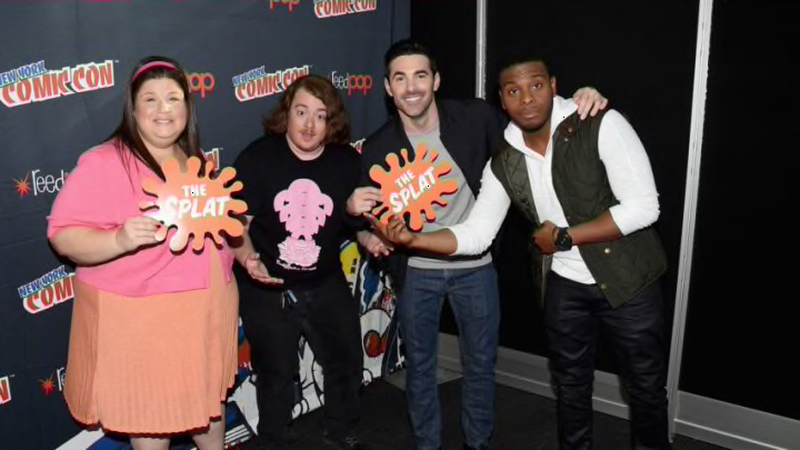
80s and 90s kids rejoice! If you haven’t already heard the news, the “splat” logo design made famous during that duel era of Nickelodeon programming is making its way back! Re-watching shows like Double Dare, Doug, and Clarissa Explains It All may conjure up memories of your childhood and this logo definitely has a place alongside those memories. This branding comeback is happening almost a decade after the network decided to can the logo in favor of more contemporary branding. If you want to learn more about the history of the logo, read on it and find out!
Scott Nash, a then-recent design school graduate in the early 1980s and was able to snag a meeting with Nickelodeon executives to help create their logo alongside one of his design school professors, Tom Corey.
According to Nash, the duo had a limited amount of time to come up with solid ideas to present to these executives,
"“We had these, in retrospect, some really bad ideas,” Nash tells Yahoo Entertainment. “One of which was… because they were owned by MTV, we would come up with something that was the equivalent of NTV. And instead of having the ever-changing M, we thought we’d turn the N into a door, which would… sort of greet kids and allow us to come into the world of Nickelodeon. But it was a really short-sighted idea, and one that I wasn’t comfortable with.”"
Eventually, they decided on the idea of a “splat” logo and found that Pantone 021, which is the vibrant orange seen within a majority of Nickelodeon’s branding “just screams “FUN!” after deliberating with Corey on whether it would be lime green or orange. Nash explains further.
"“We somehow got some information as to what colors adults least liked at the time. And lime green was one color. The other color was orange, and we went with orange because green is a keyable color,” Nash says, explaining that green-screens often used for backgrounds at that time were blue or, well, green. “And so we weren’t allowed to do that. We couldn’t use green as the logo color, and so it became orange.”"
Since then, there have been many iterations of the “splat” logo and even some non-“splat”-related ones that have graced our screens. Nash fondly recalls that the product division, those responsible for making clothing merchandise, toys and other, boded well with the logo because, in terms of brand identity, logos should remain consistent in order to encourage customer loyalty. People can then acknowledge and remember a familiar look when browsing and eventually purchasing those products for themselves or for their young ones. That being said, due to the popularity of their work, Nash and his professor ended up gaining more clientele with the popularity of their work as they went on to create brand-related imagery for other networks such as Comedy Central, Cartoon Network, FX and more.
This is incredible news for hardcore Nickelodeon fans from both the past and present. This new version of the “splat” will be seen alongside programming such as the revivals of series Are You Afraid of the Dark? and All That and a new lineup of network IDs will debut throughout the rest of 2023.
